HTML and Javascript Slideshow

This is an extremely easy-to-use and highly customizable HTML and Javascript Slideshow developed using jQuery. Instead of adopting a component-based design, the slideshow is developed in a template manner where each template only includes the necessary CSS and Javascript codes. This allows the slideshow to be included in an existing web pages with very little additional bandwidth. Customizations and extensions can also be easily incorporated into the slideshow by changing the necessary codes. This design allows everyone to understand and confidently make use of the templates without messing around with a large amount of Javascript and CSS codes.

We have many years of development on the web and we have found this methodology the most productive as compared to using a bloated component. There will be times when you need to make additional extensions to the component or you may realize that your component has some bugs in certain browsers. It is difficult to fix the bugs when the component contains a large amount of codes.

Each of the slideshow templates is developed using the same basic principles as described in a section below. The basic principles will be very useful to you if you are going to create your own slideshow components from scratch.

Our philosophy is simple : "Use what you understand. Understand what you use."

Slideshow templates

  • Simple Slideshow
    The basic slideshow without transition effects. This slideshow provides the basic framework for all of our other slideshows. This slideshow is explained in details below.
  • Fade In/Fade Out
    A slideshow using Fade In/Fade Out transition effects.
  • Slide Left/Slide Right
    A slideshow using the Slide Left/Slide Right transition effects.
  • AutoPlay Fade
    This slideshow will automatically fade to the next slide after the specified seconds. Once any of the navigation buttons are clicked, the "autoplay" feature will be turned off.
  • AutoPlay Slide
    This slideshow will automatically shift/slide to the next slide after the specified seconds. Once any of the navigation buttons are clicked, the "autopllay" feature will be turned off.

Using the HTML Slideshow

The following is a complete tutorial on using the HTML and Javascript slideshow. We strongly recommend that you read this section. It allows you to understand the inner workings of the slideshow and make the job of customization very easy. All other and future slideshow templates will be designed based on this framework described. The diagram below provides an overview of the slideshow. The "right" button allows you to navigate to the next slide. The "left" button allows you to navigate to the previous slide. Overall, the slideshow consists of HTML, Javascript, CSS and images working together hand in hand.


The following shows the HTML portion of the slideshow. It uses a CSS class with ID "container" for declaring a section for the slideshow. All images and buttons for navigation are defined within this "container" section. The <ul> element (Unordered List) is used to list all the images of the slideshow. Note that the width and height of the images are specified for each of the list elements.

	<div id="container">
	<ul>
	<li><img src="picture1.jpg" width="604" height="453" /></li>
	<li><img src="picture2.jpg" width="604" height="453" /></li>
	<li><img src="picture3.jpg" width="604" height="453" /></li>
	</ul>
	<span class="button prevButton"></span>
	<span class="button nextButton"></span>
	</div>	
	  
The following shows the CSS definitions of the "container" class and the related <ul> unordered list. Note that the width and height need to be the same as the dimensions specified in the HTML codes. The line "list-style:none outside none;" overrides the default behaviour of showing a dot before each unordered list item.

	#container{
		width:604px;
		height:453px;
		position:relative;
	}

	#container ul{
		width:604px;
		height:453px;
		list-style:none outside none;
		position:relative;
		overflow:hidden;
	}
	  
The following CSS codes define the first child and the normal child of the unordered list. This is the part that overlays the different images on top of each other to form the slideshow. Notice the "first-child" has "display" set to "list-item" whereas other list items have "display" set to "none". This is designed so that the first image will be displayed on the HTML page. On top of that, since the "position" of the items is set to "absolute", all the images are overlaid on top of each other.

	#container li:first-child{
		display:list-item;
		position:absolute;
	}

	#container li{
		position:absolute;
		display:none;
	}
	  
The <span> element in the HTML defines the two navigation buttons for moving onto the next or previous slide. The navigation buttons uses the "prevButton" and "nextButton" CSS class.

The definition of the "prevButton" CSS class is as shown below. The "nextButton" classes is similar and hence we will not show the example. There is another CSS class, the "button" class used in the HTML codes. This class is only used in the Javasccript codes for identifying that a navigating button has been clicked.

	#container .prevButton{
		height:72px;
		width:68px;
		position:absolute;
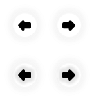
		background:url('buttons.png') no-repeat;
		top:50%;
		margin-top:-36px;
		cursor:pointer;
		z-index:2000;
		background-position:left top;
		left:0
	}

	#container .prevButton:hover{ 
			background-position:left bottom;left:0;}
	  
The CSS code example above uses an image call "buttons.png". This image is as shown below. The upper "left" and "right" buttons are the images displayed by the HTML page when the mouse did not hover on top of the navigating buttons in the slideshow. The lower "left" and "right" buttons are the images shown when the mouse hovers on top of the navigating buttons.

The dimension of the entire "buttons.png" image is "136x144". The "width" and "height" of the "prevButton" class is derived by dividing the width 136 by 2 and the height 144 by 2. The line "background-position:left top;" indicates that the "previous" button in the slideshow uses "68x72" from the "top left" corner of the "buttons.png" file.

When the mouse pointer hovers on top of the "previous" button, the line ".prevButton:hover" comes into action. This line instructs the browser to now use the cutout (68x72) image from the "left bottom" corner of the "buttons.png" file. This allows the highlighting effect to be achieved.


The following Javascript code example shows the final piece of the slideshow. The code is developed using jQuery. If you have not heard of jQuery, we strongly suggest that you take a look at it. It is one of the best frameworks available for developing cross browsers solution in Javascript.

The Javascript code example below defines a "click" action for the CSS class "#container .button". If you recall from the HTML codes, the "previous" and "next" button defined in the <span> elements uses the "#container .button" class. Once any of these buttons are clicked, the Javascript/jQuery code calculates the next page to display. The line "currentPage.hide();" hides the current slide while the "nextPage.show();" displays the next slide.

<script>
$(window).load(function(){
		var pages = $('#container li'), current=0;
		var currentPage,nextPage;

		$('#container .button').click(function(){
			currentPage= pages.eq(current);
			if($(this).hasClass('prevButton'))
			{

				if (current <= 0)
					current=pages.length-1;
				else
					current=current-1;
			}
			else
			{
				if (current >= pages.length-1)
					current=0;
				else
					current=current+1;
			}
			nextPage = pages.eq(current);	
			currentPage.hide();	
			nextPage.show();		
		});
});
</script>
	  
We have come to the end of this tutorial. You will be interested to know that all our slideshow templates are built with the principles described above. We have other slideshows with transition effects such as fade in/fade out and slide left/slide right, and also slideshows that automatically transit the slides.

License : GPLv3

Browser Requirements